Seamless digital menu for a modern dining experience
Project Overview
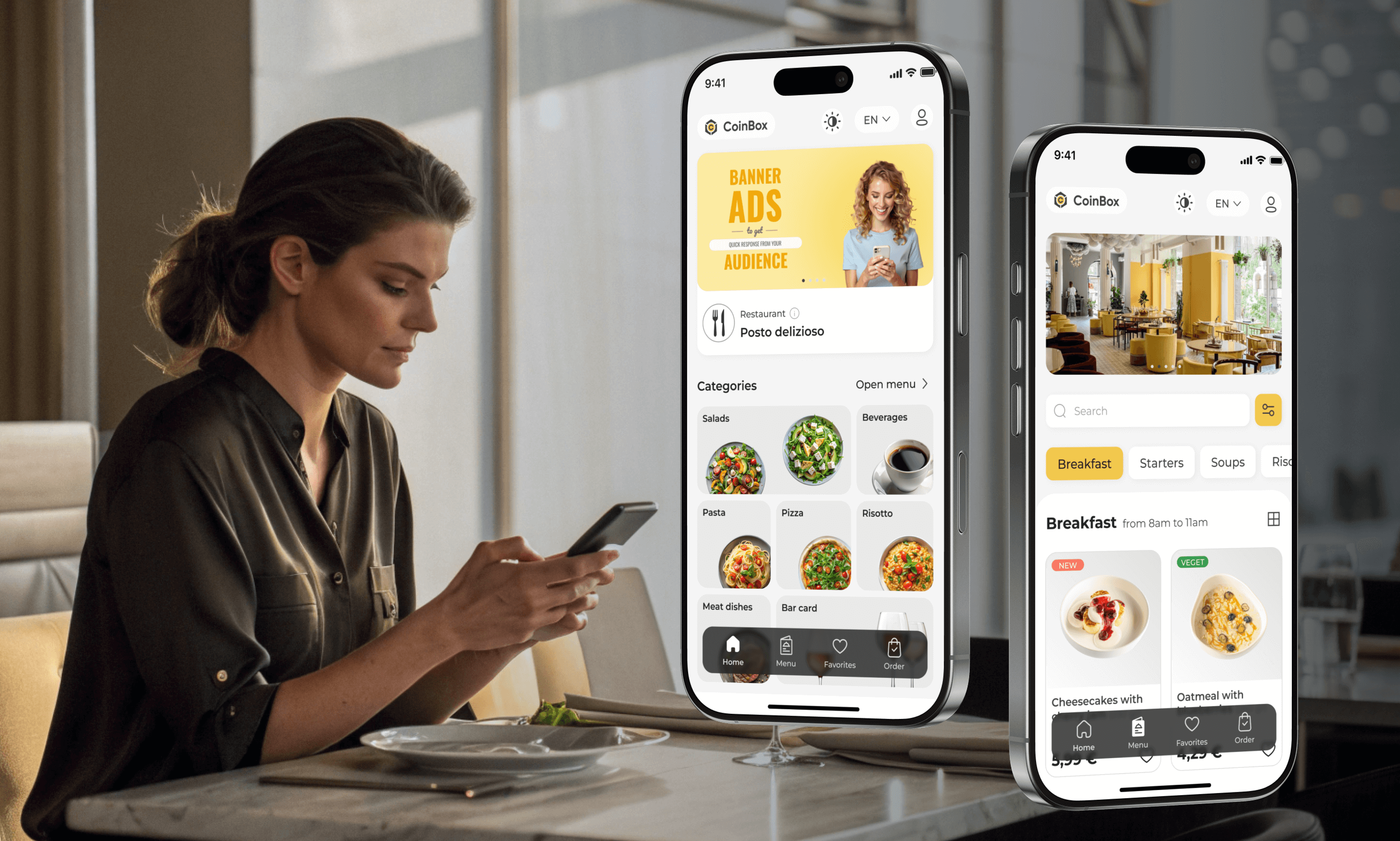
This project focused on creating a seamless digital experience that allows guests to instantly access interactive menus through QR codes or external links, making dining more convenient and engaging
Industry
FoodTech
Client
CoinBox Itd, Kazakhstan
My role
UX UI Designer
Tools
Figma, Adobe Illustator
Problem Statement
To design a flexible service that works seamlessly across various types of dining establishments – restaurants, coffee shops, wine bars, and more – while keeping the experience simple and consistent for end users.
Solutions
Researched the market and analyzed competitors to define best practices, understand the specific needs of various dining establishments, and capture user expectations to deliver a smooth, user-centered experience.
Design Process
My design process involves a series of steps to create a visually appealing and intuitive user experience for the CoinBox QR Menu
Discover
3 weeks
Analyzed competitors
User and stakeholder interviews
Customer journey map
Personas
User flows
Sitemap
Design
3 weeks
Wireframes
Interactive prototype
UI design
UI kit
Deliver
2 weeks
Transfer to development
Design reviews
A/B testing
Implemented feedback
What I Learned from UX Research
.png)
Business Needs
Owners want to provide complete menu information to engage more customers and increase average check size
.png)
User Expectations
Guests want access to all key product information to make a confident and informed choice.
.png)
Design Challenge
Product cards must adapt to venue-specific needs while staying universal and simple
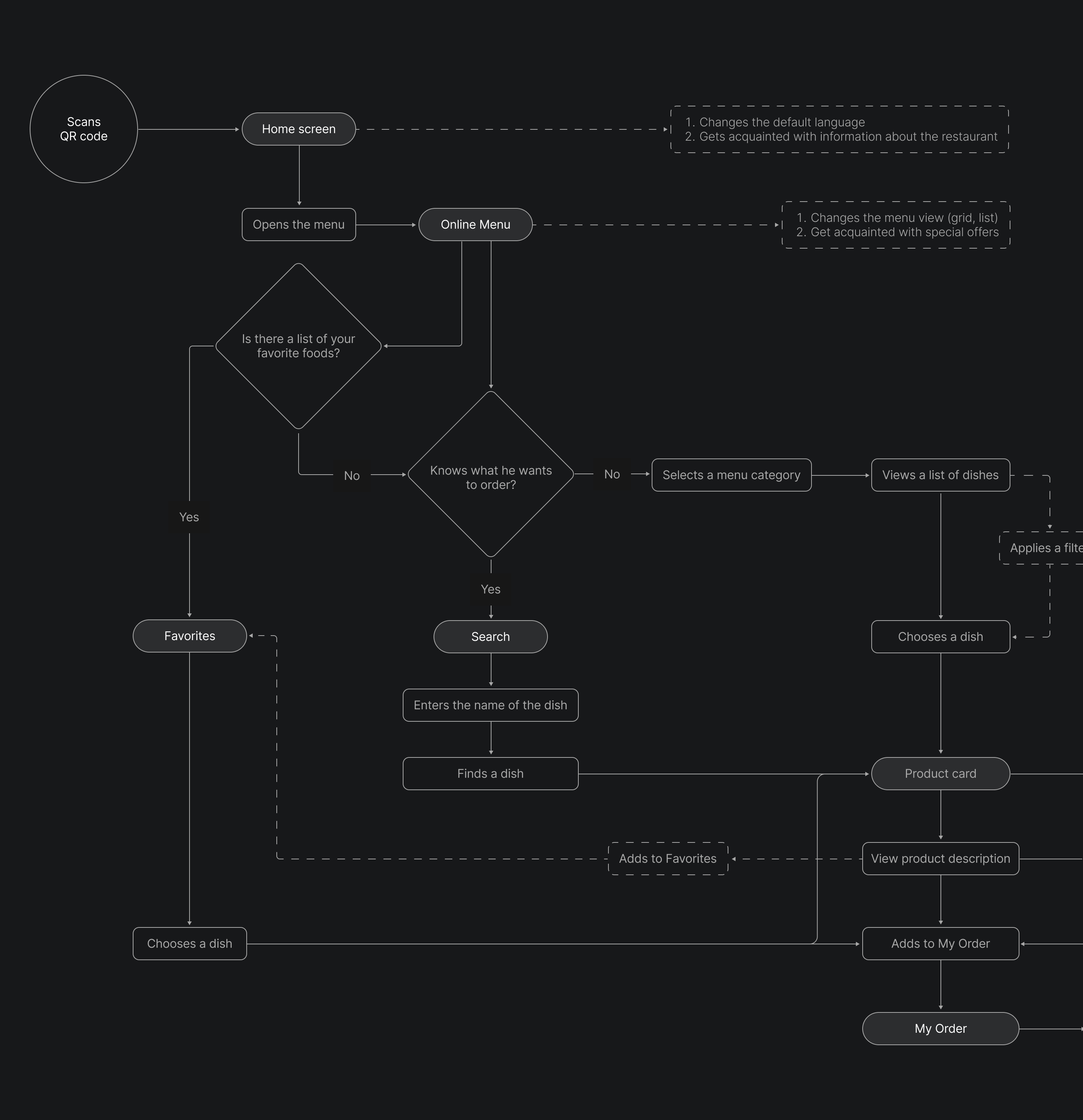
User Flow
By mapping the user flow, I ensured intuitive navigation and a seamless product experience
Wireframes
Beginning with hand sketches, I translated my ideas onto paper

Creating low-fidelity wireframes made it easier to align with the client on product functionality and layout before moving into detailed design

Сolor palette
I applied the company’s existing color scheme to ensure visual consistency and enable seamless integration of the new service with other products in the ecosystem
#212121
#F2C94C
#424242
#9E9E9E
#E0E0E0
#F5F5F5
#FFFFFF

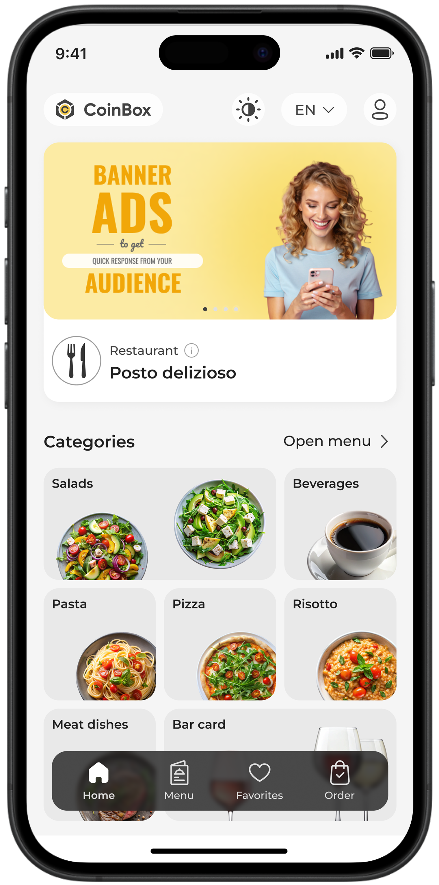
Home Screen
Сombines a promotional banner, restaurant info, and a clear grid of food categories for quick navigation. A fixed bottom menu ensures easy access to the main sections
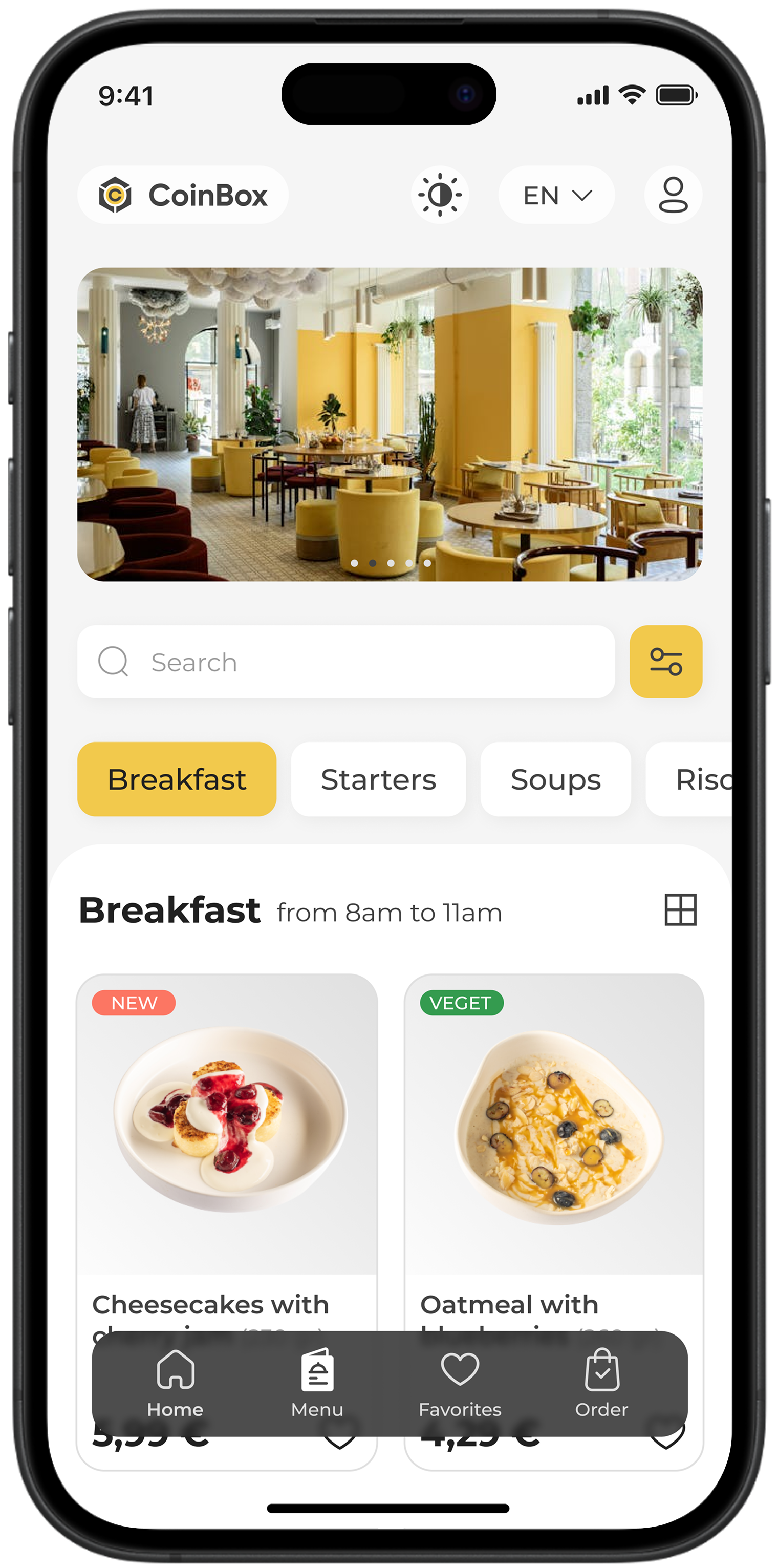
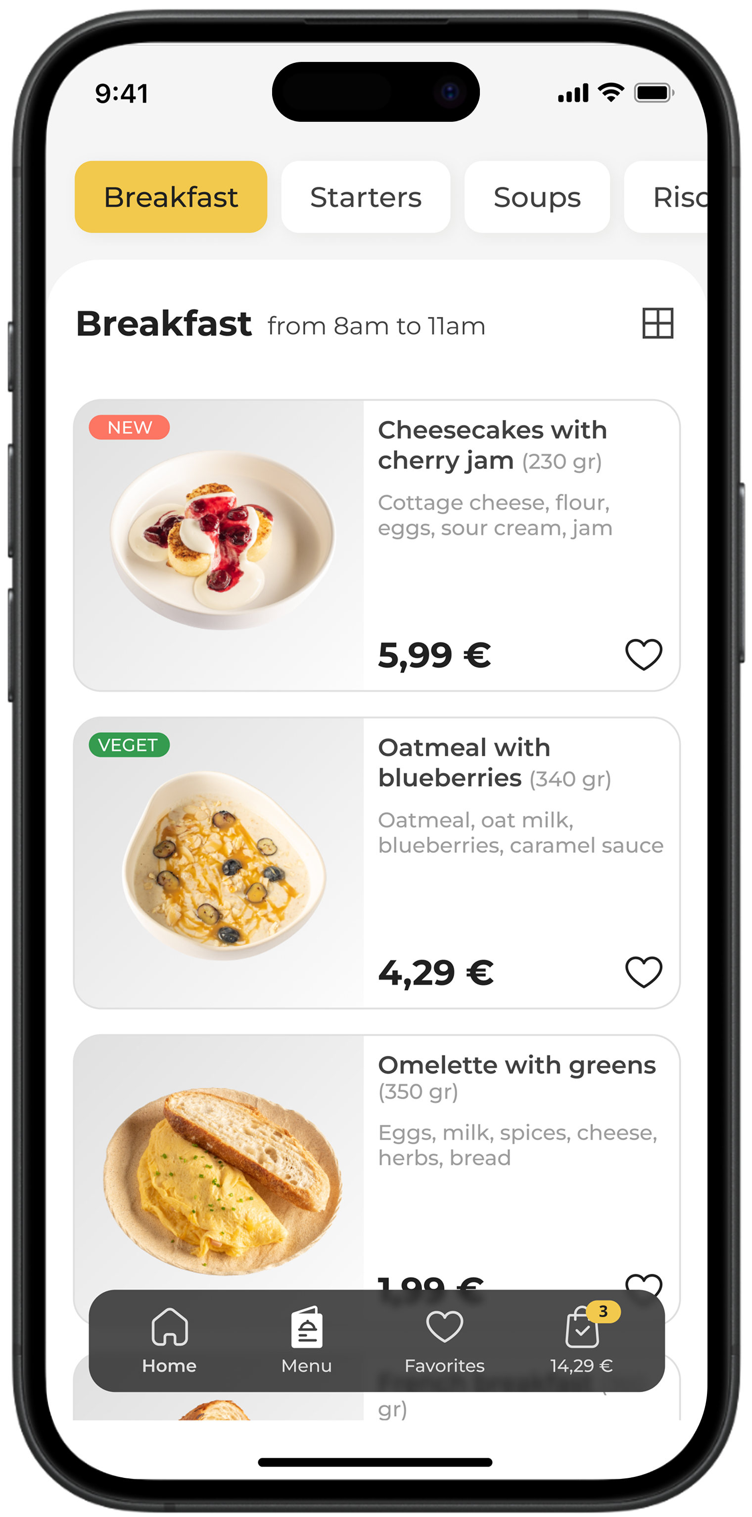
Menu Screen
Оffers flexible navigation through vertical and horizontal layouts, allowing users to choose the most convenient way to explore dishes. This adaptability enhances usability across different contexts — from quick decision-making to detailed menu exploration
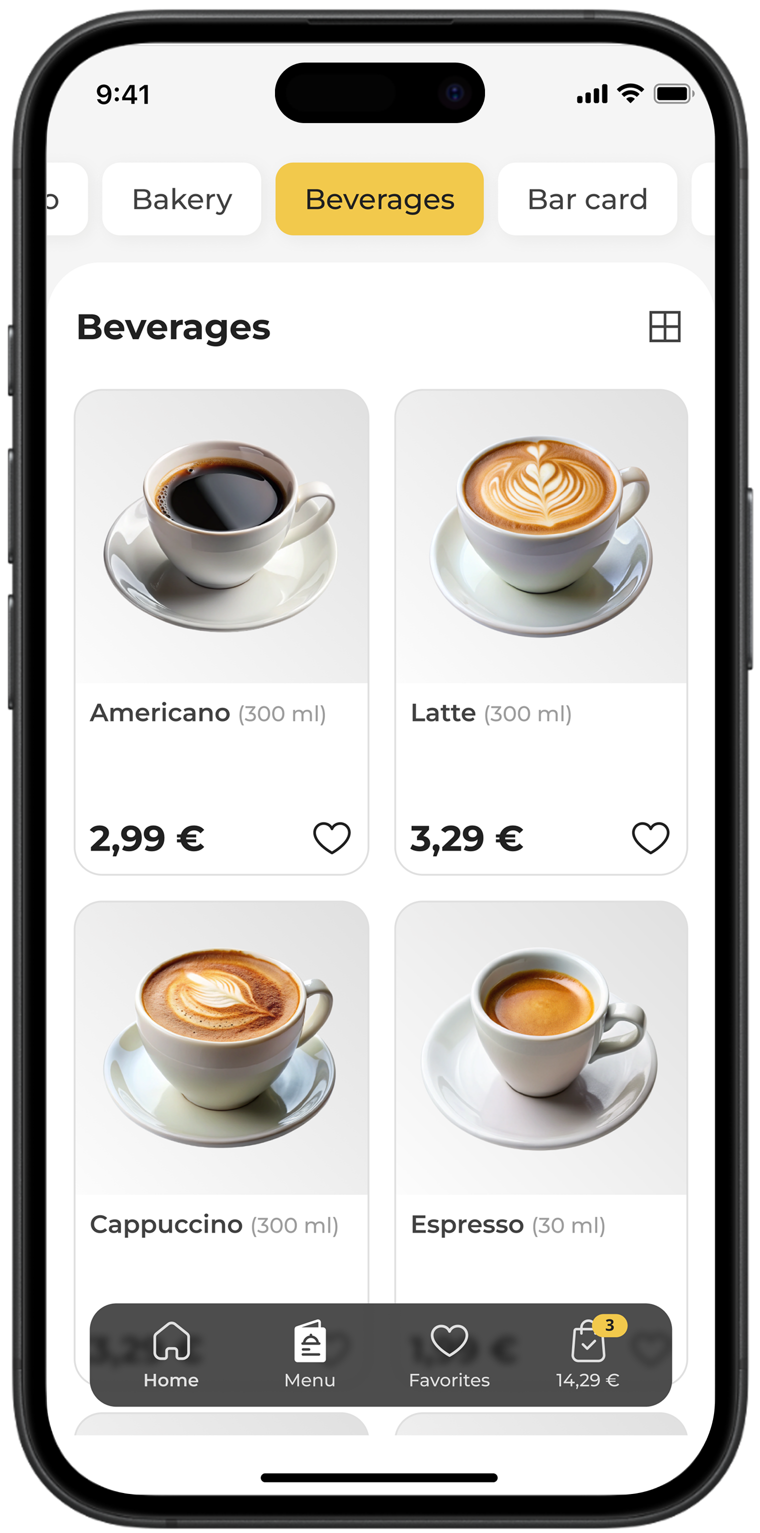
Product Screens
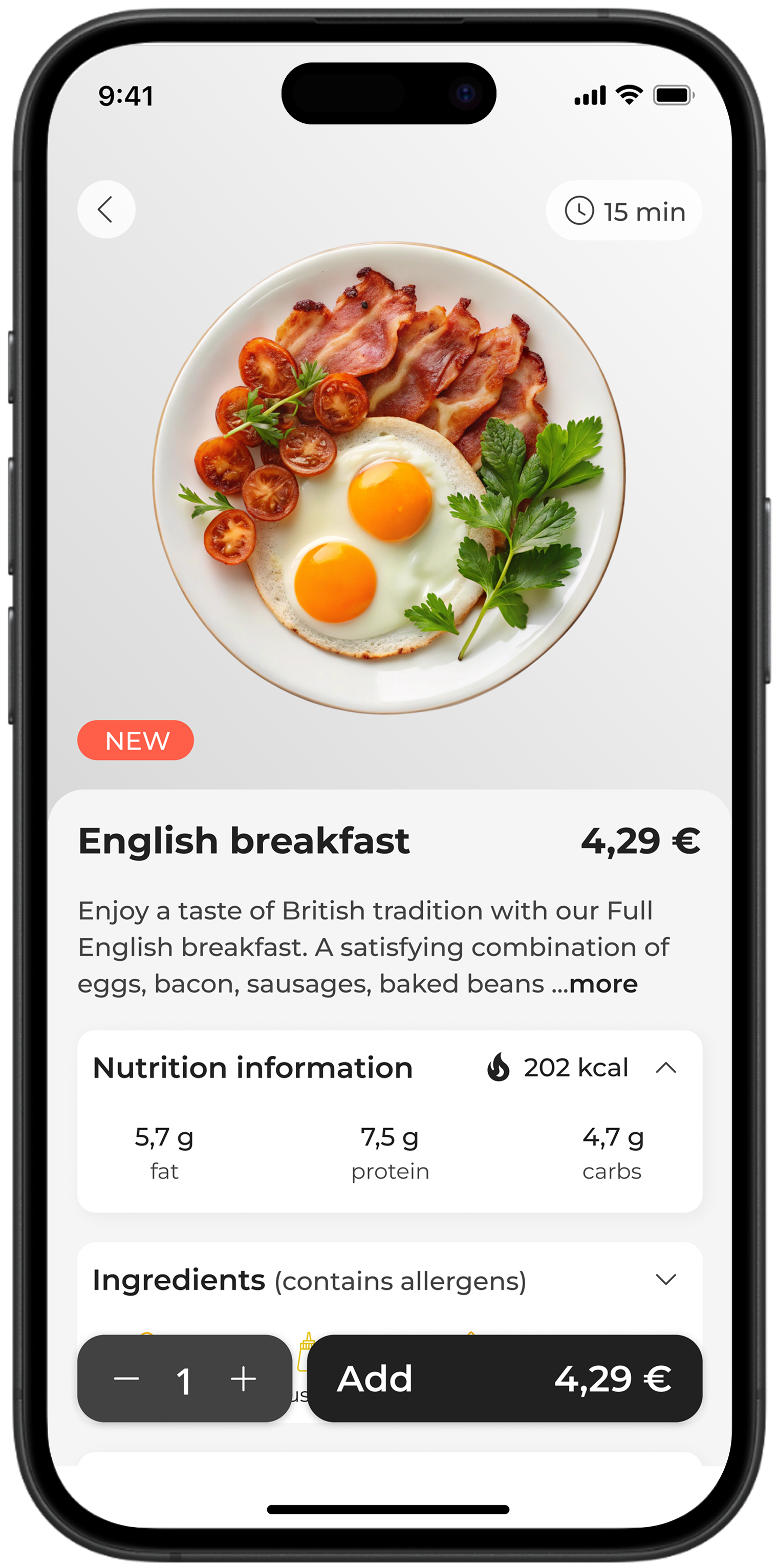
I designed product screens that balance visual appeal with usability, adaptable for different types of venues and enabling detailed presentation of each item
Descriptions make it easy for users to know what each dish offers

Large product photos create a clear visual focus
Dish details help users decide what to order
Dish Card
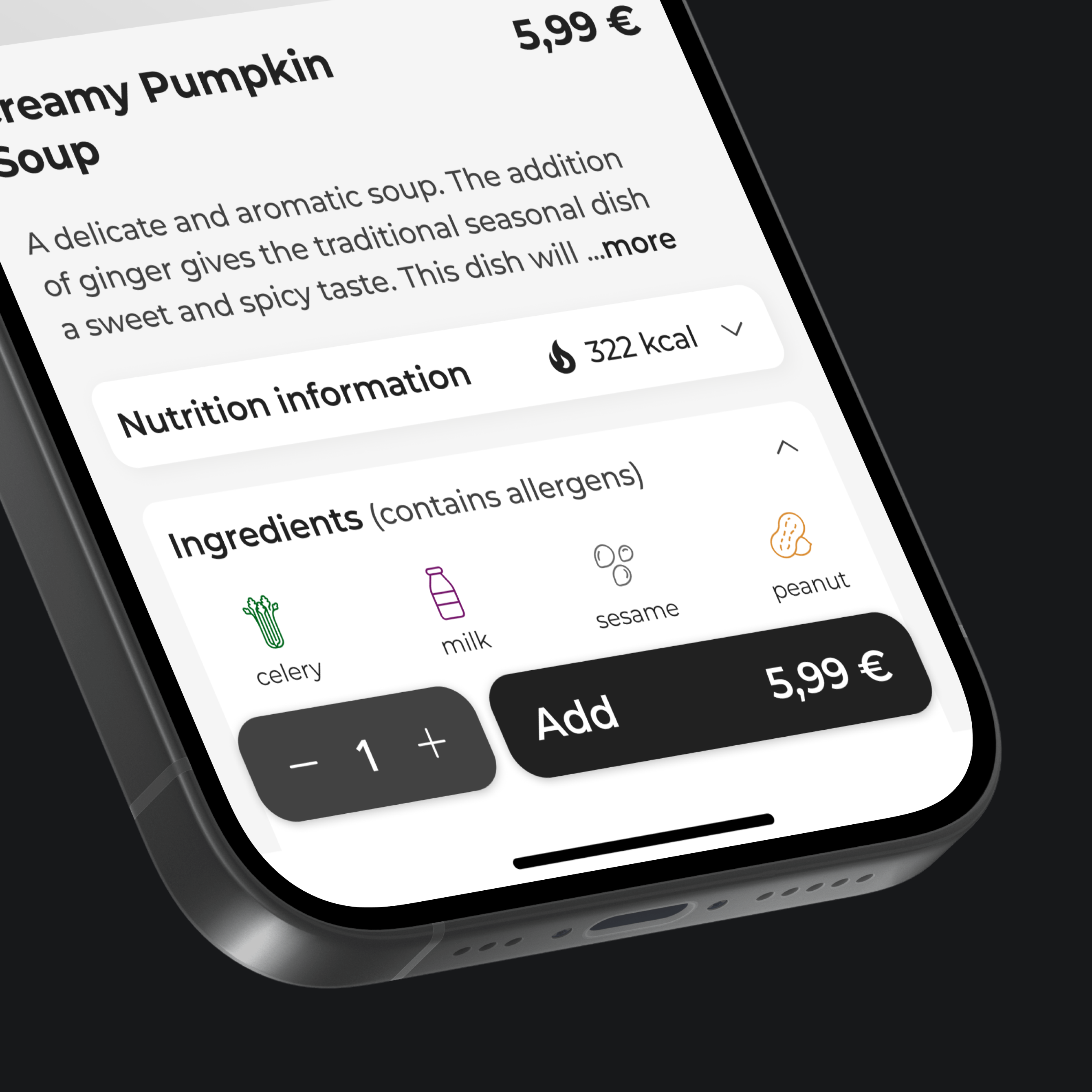
Some restaurants allow customers to customize dishes by managing ingredients. I designed a product card that includes dedicated sections for ingredient selection
Nutritional info helps users make informed and healthier dining decisions
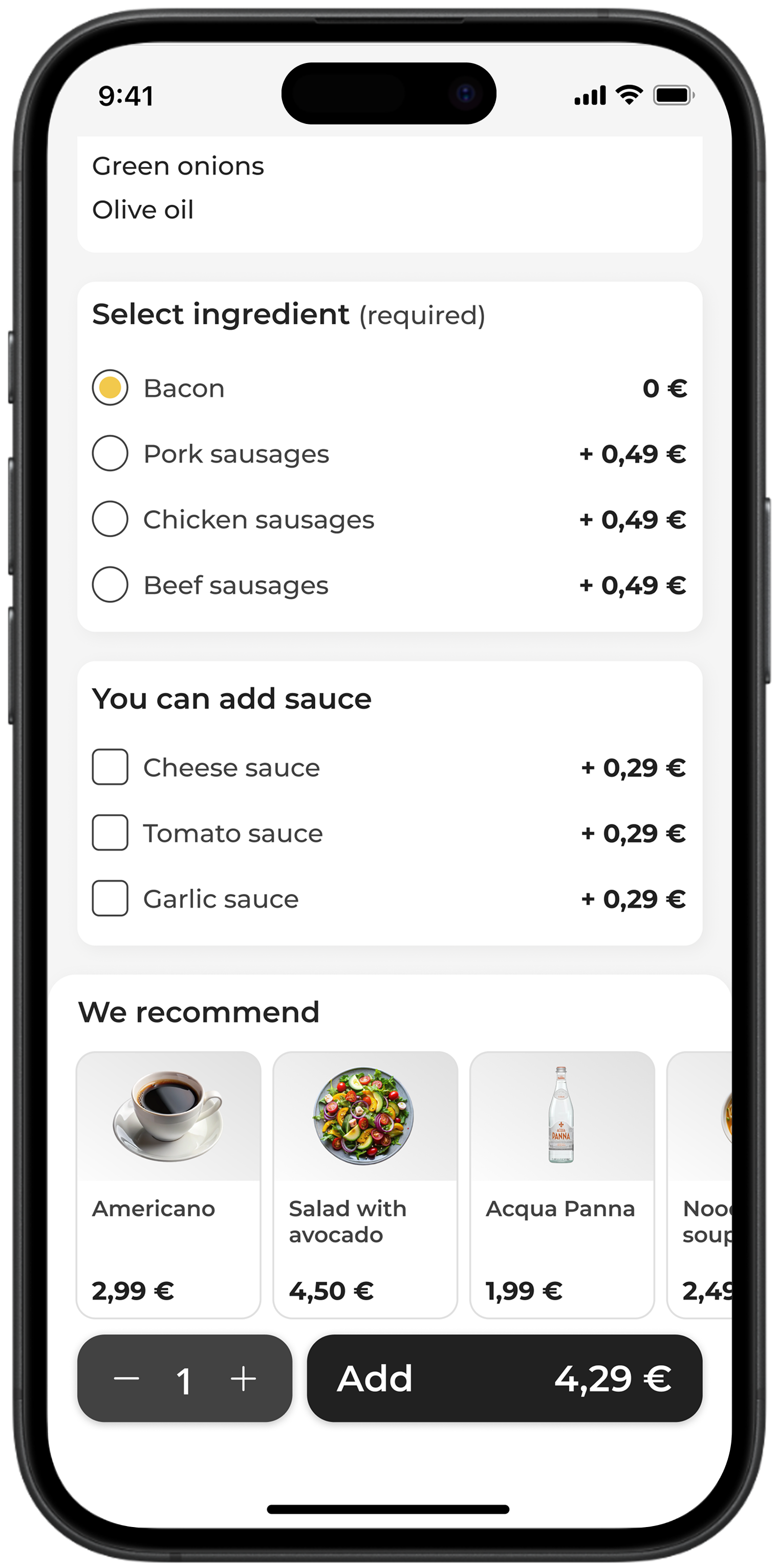
For dishes with required ingredients, I designed a radio button block
For dishes that can be customized with extra ingredients, I designed a checkbox block
Coffee Card
The coffee card was created for modern cafes, enabling users to personalize their drinks and enjoy a seamless, interactive ordering experience
Option to select the preferred drink size

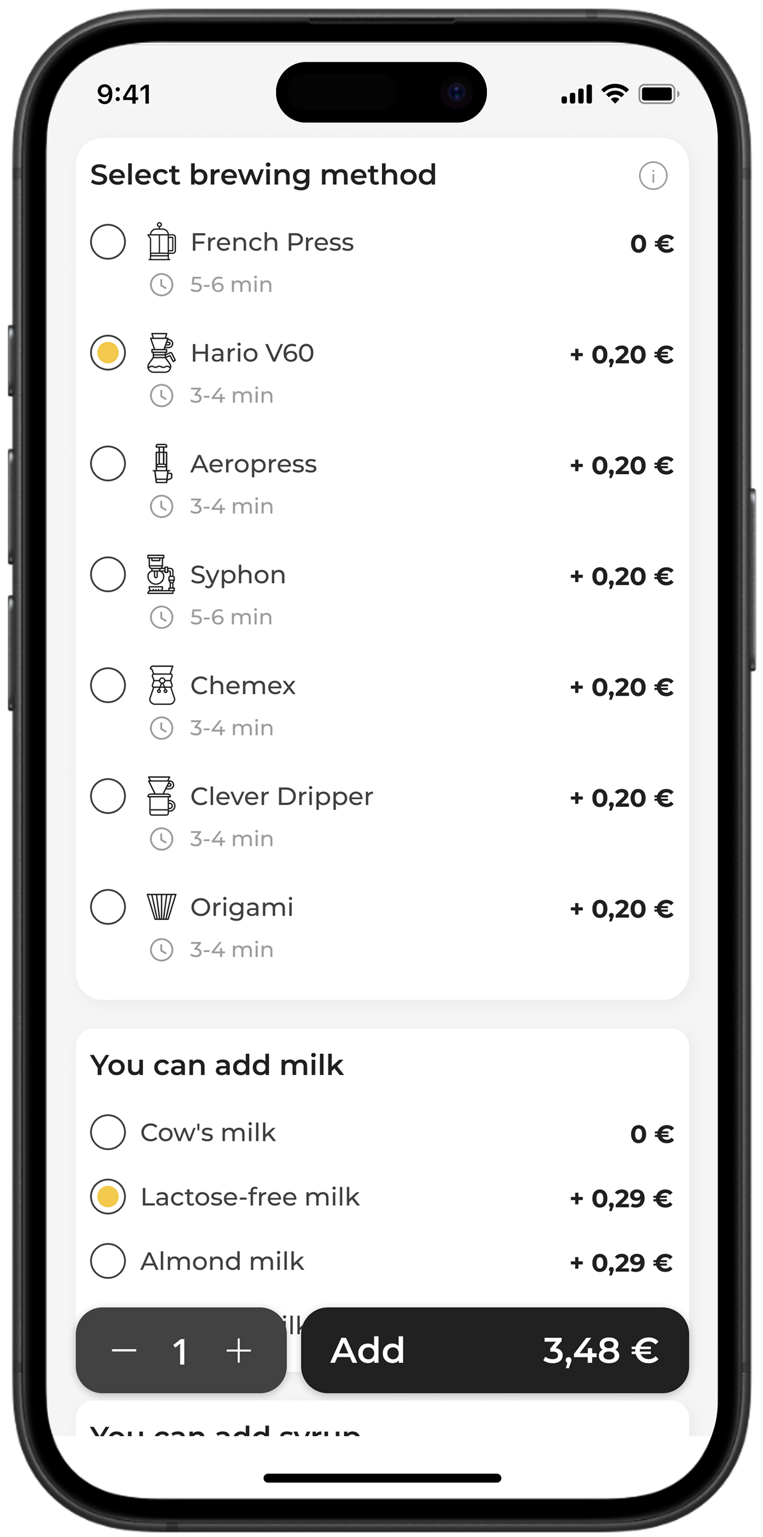
A block was designed to allow users to choose an alternative coffee brewing method
Users can personalize their drinks by adding favorite ingredients to enhance the flavor
Wine Card
To help wine bars offer guests complete wine details, I created dedicated blocks that present information clearly and intuitively
A tag on the photo indicates the type of wine
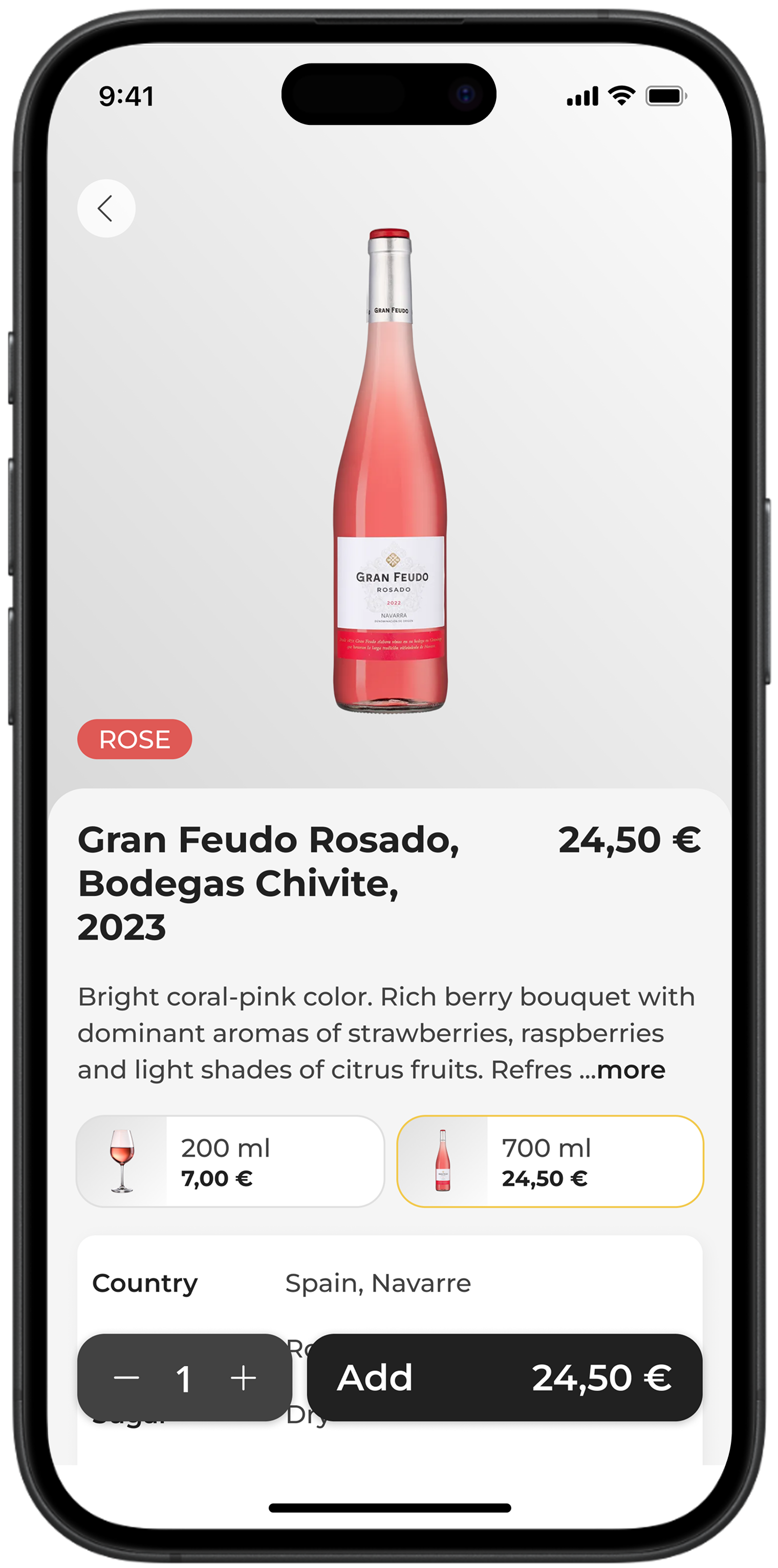

Comprehensive details about the wine for informed choices
Visual blocks showing wine characteristics and main flavors with clear icons for easy understanding
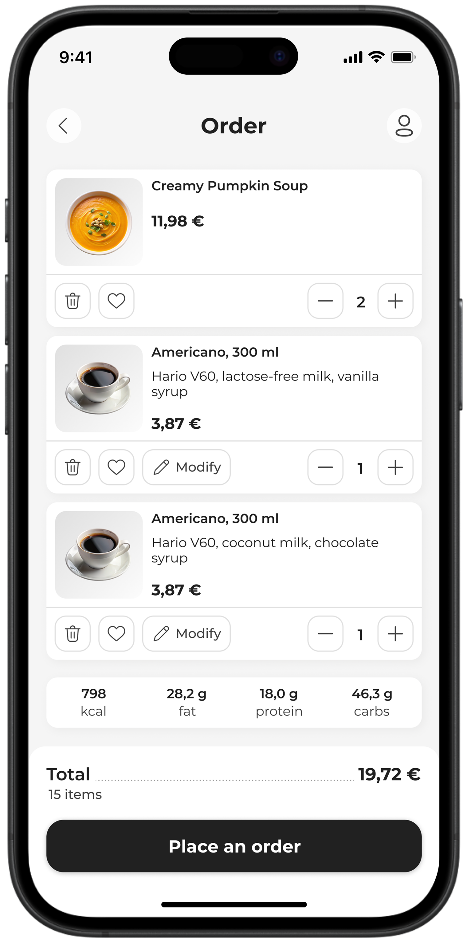
Order Screen
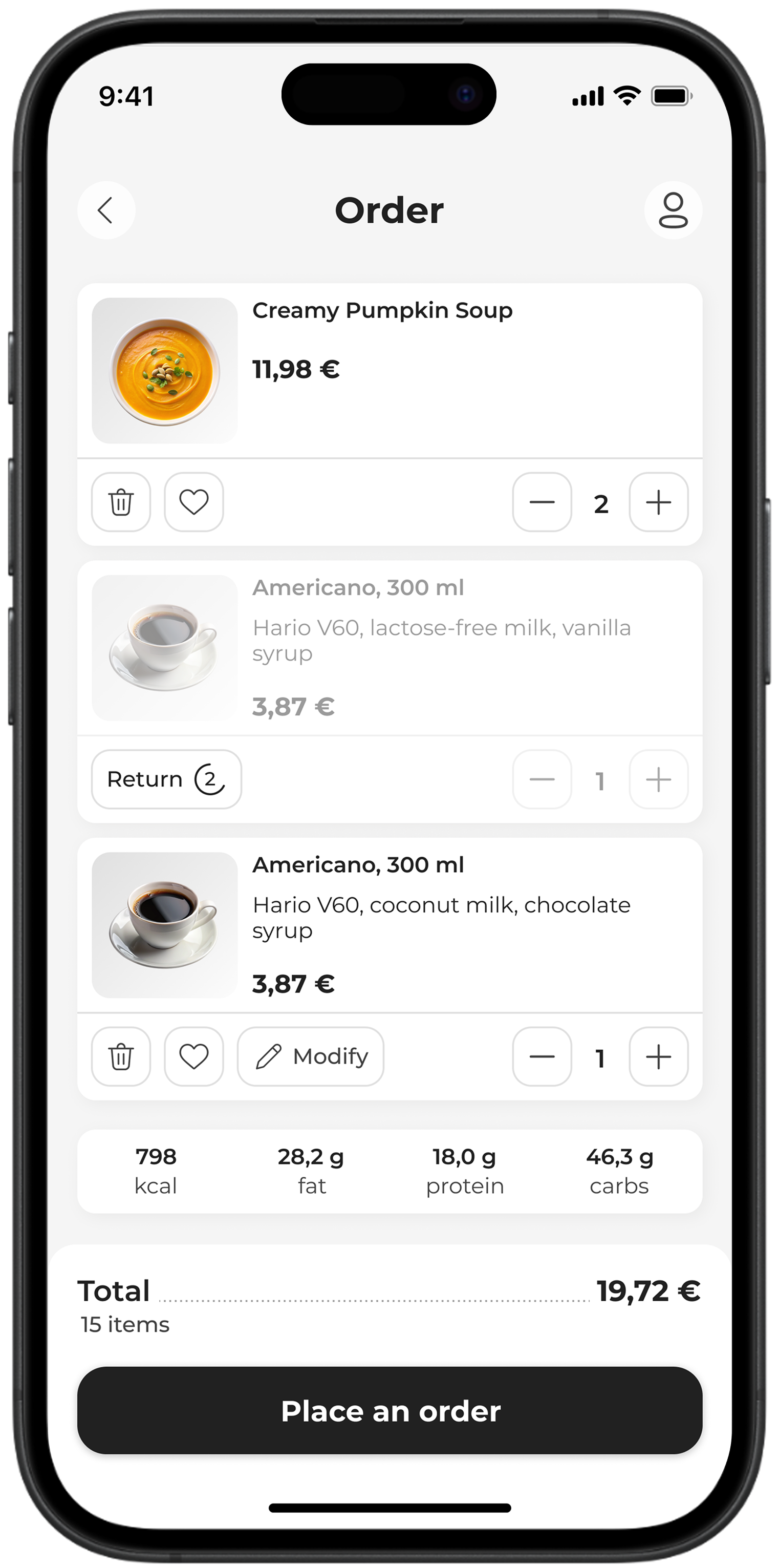
To enhance user convenience, the order screen allows users to change quantities, remove items, add to favorites, or modify dishes without returning to the product card

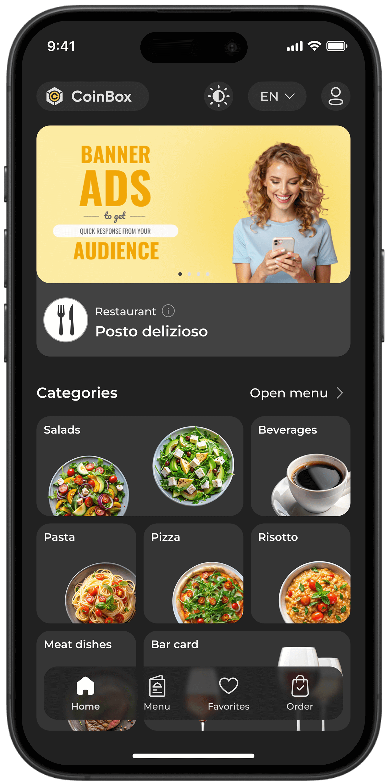
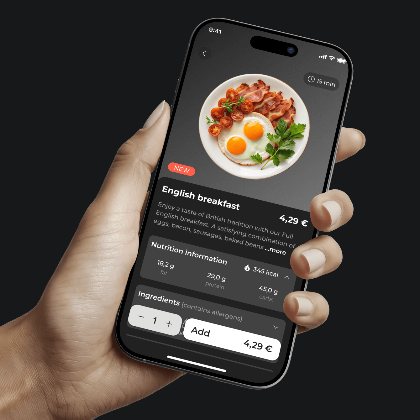
Dark Mode
I created a dark mode for the QR menu, giving users the flexibility to toggle between light and dark themes based on their personal preference
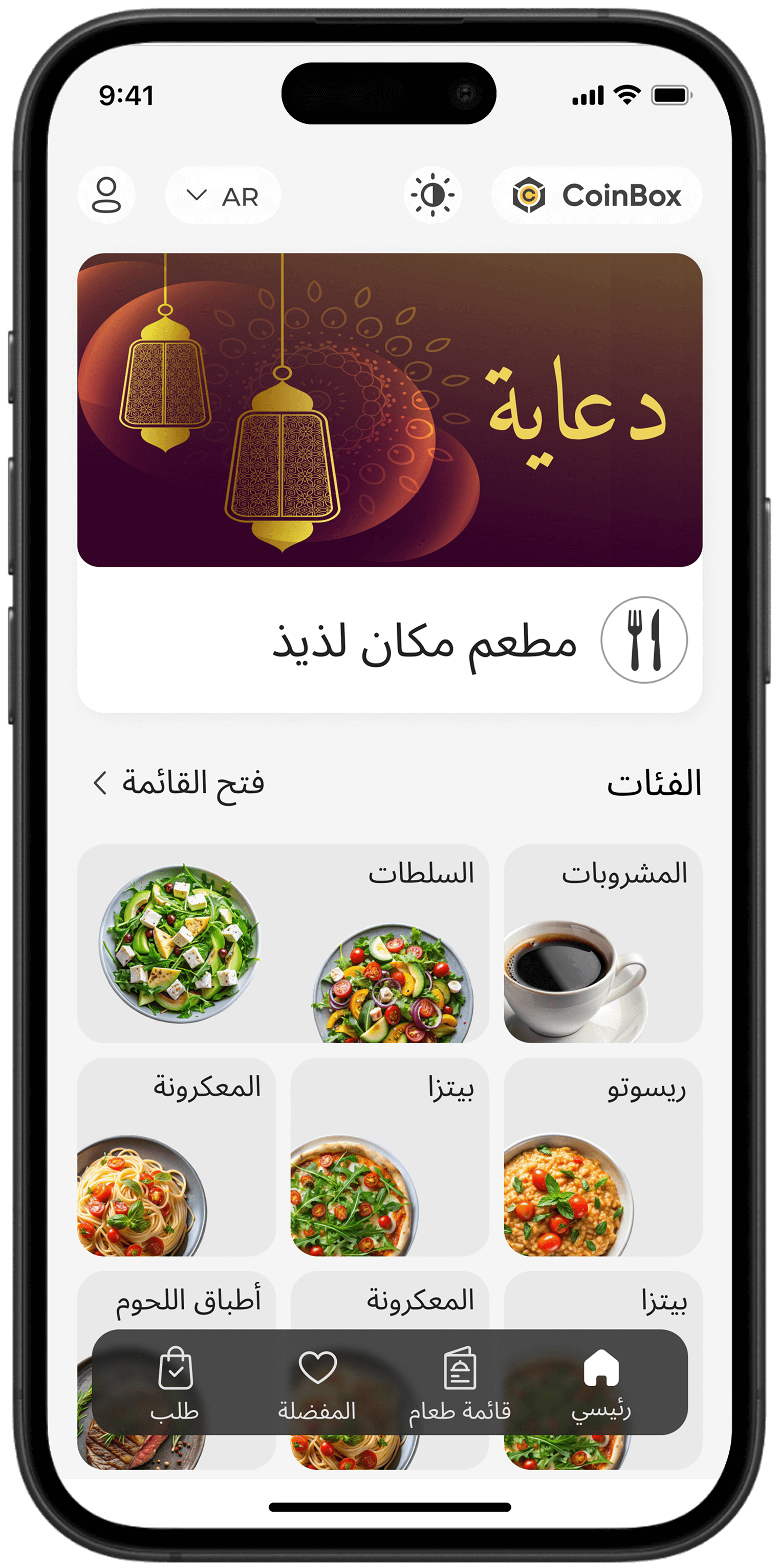
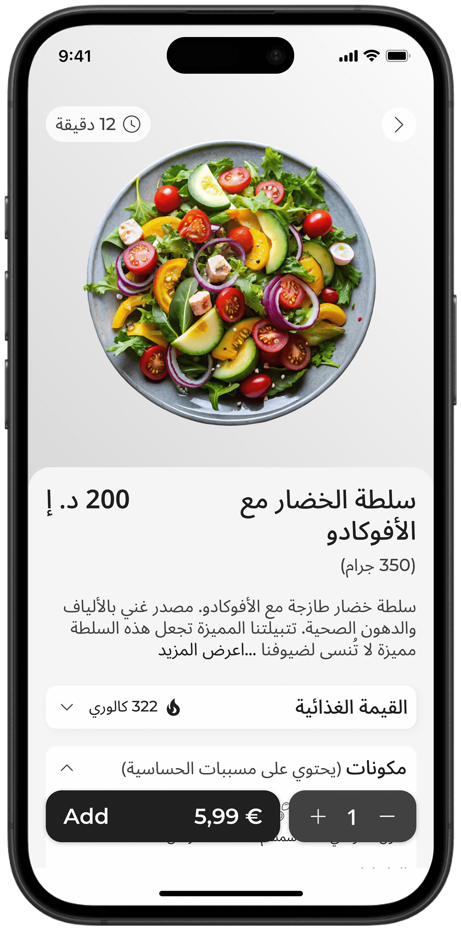
Right-to-Left
I adapted the QR menu for Arabic users by enabling right-to-left reading, enlarging fonts, right-aligning text, adjusting icons, and refining other interface details for optimal usability

What comes next
The QR menu is currently running in test mode in several restaurants across Kazakhstan. After collecting user and business feedback, improvements will be introduced where needed.
Next, the menu will be expanded with online payment and tipping features, integrated directly with the client’s existing service

